01. Background
As part of the course Communication Design Basics at Hochschule Rhein-Waal, students were asked to develop visual concepts for a poster competition organized by BG RCI (Berufsgenossenschaft Rohstoffe und chemische Industrie).
The brief focused on one of the most common workplace accident categories: slips, trips and falls.
BG RCI statistics describe these incidents as responsible for about 30 to 40 percent of all workplace accidents, often with serious consequences such as fractures or head injuries.
02. Concept
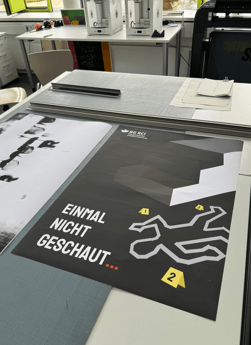
My goal was to create a minimalistic but emotionally direct poster that communicates the idea in a single glance.
The message is simple: accidents happen in the moment when a person does not pay attention.
The key visual is an abstract geometric shape that looks stable at first, but reveals a dangerous edge when viewed closely. It represents the type of unnoticed obstacle that often causes real accidents.
The slogan “Einmal nicht geschaut…” reinforces this idea in a conversational tone. It sounds like a warning from a colleague or friend, which matches the intention of raising awareness without using fear-based messaging.
03. Visual Approach
Clean geometry and strong contrast
The black and white composition makes the hazard easy to read and instantly recognizable.
A subtle red accent in the ellipsis adds tension and suggests the moment before an accident.
Optical illusion as metaphor
The 3D shape creates a sense of visual uncertainty. What appears to be a continuous surface suddenly becomes a drop or an edge. This mirrors the nature of real slips and falls.
People often trust their automatic movement and misjudge surfaces, which is a point BG RCI repeatedly highlights in their materials.
04. Why this concept fits BG RCI
The poster aligns with key expectations of the competition:
Clear message
The viewer understands the warning within seconds.
Emotional impact
The unstable geometry makes the viewer physically aware of the risk.
Behavioral reminder
The phrase “Einmal nicht geschaut…” emphasizes that most accidents occur during routine movement when attention drops.
The minimal, symbolic style matches the look of many successful posters from past BG RCI campaigns.
05. Process
Research of BG RCI materials, safety guidelines and statistics.
Development of several conceptual directions based on metaphors of instability and perception.
Sketching of optical geometries and testing how they communicate danger.
Selection of typography that keeps the message simple, direct and human.
Final digital rendering in Figma and Illustrator.
06. Result
The poster works as a standalone piece and can be expanded into a series, for example:
“Einmal nicht gehalten…” with handrail-related imagery
“Einmal nicht gespürt…” focusing on slippery surfaces
“Einmal nicht geprüft…” showing a hidden hazard
The structure of the concept allows easy development of a full campaign system.
07. Reflection
The project improved my ability to create conceptual posters, use visual metaphor effectively and communicate safety-related messages in a clear and modern way. It also helped me practice adapting my design language to a strict professional brief.