Overview
BLINK is a fictional two-day festival in Düsseldorf built around Y2K aesthetics: early-2000s pop culture, chrome typography, and digital nostalgia. The brief asked for a complete visual identity, not just a poster: a system that could hold together across print, wearables, and social media without falling apart into disconnected assets.
The goal wasn't to decorate a festival name with trendy graphics. It was to define why BLINK looks the way it does, then prove that logic works across seven different formats.
The Challenge
Y2K as a style is easy to imitate and easy to get wrong: chrome bubble letters and pink gradients read as costume rather than brand if there's no structure underneath. The challenge was to keep the nostalgic, maximalist surface while giving it enough typographic and structural discipline that it could function as an actual festival brand, something a stranger could recognize across a billboard, a wristband, and an Instagram story without a logo in frame.
Concept
BLINK is built on a simple tension: nostalgia vs. digital future. It borrows the emotional language of early-2000s club and pop culture (inflated chrome type, glossy surfaces, playful excess) and runs it through a modern, minimal structure.
Keywords set early and used as a filter for every decision: nostalgic, playful, futuristic, glossy, youthful, cyber love, chrome, energetic. Any element that didn't serve at least one of these got cut.
Tone of voice: playful, bold, expressive. The festival talks like it feels: loud but not chaotic, confident but not corporate.
Typography
Primary typeface: Power Grotesk.
Chosen deliberately against the Y2K bubble letters, not to match them. Power Grotesk brings a strong geometric structure and high readability, which gives the system a professional backbone underneath the more expressive chrome lettering. The contrast is the point: playful visuals need a disciplined typographic base or the whole identity reads as noise. This is the decision that separates BLINK from a generic "throw some metallic gradients on it" Y2K pastiche.
Color System
Three colors, each with a job:
Pink — the signature emotional color. Carries the Y2K pop-culture energy and most of the brand's personality.
Black — grounding and contrast. Keeps the pink from tipping into decoration-only territory.
White — clean foundation, lets the chrome shapes and bold type breathe instead of competing with a busy background.
The restraint here matters: a maximalist aesthetic still needs a limited palette to stay legible as a system rather than a mood board.
Logo
The BLINK wordmark is built to be simple, bold, and adaptable across scale and material, from a billboard to a wristband. Priorities were recognizability at small sizes, performance on both digital and print media, and enough neutrality to sit underneath expressive photography and typography without competing with it.
Applying the System
The identity was tested across formats with genuinely different constraints, which is where a "look" either becomes a brand or falls apart:
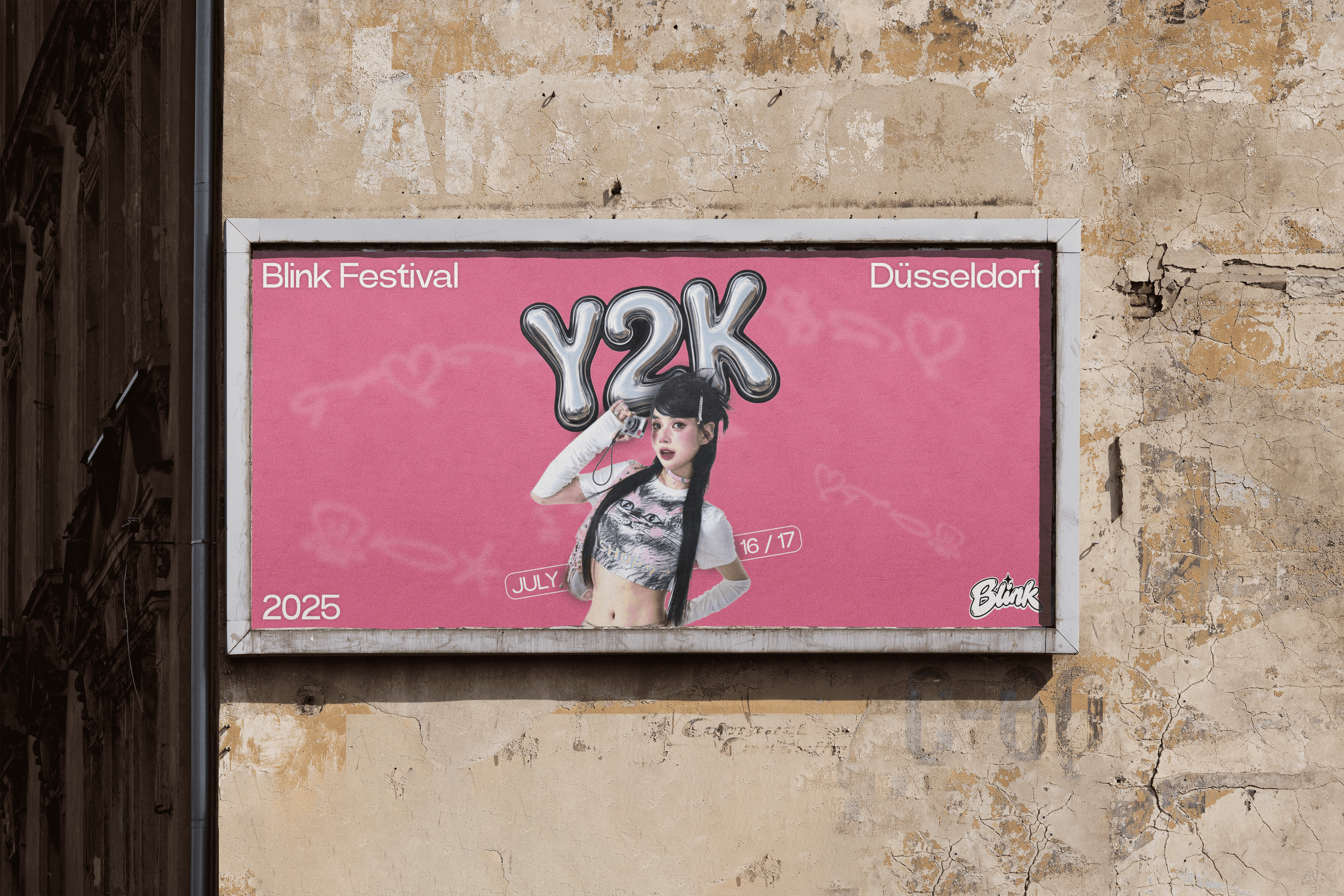
Billboard & poster — the Y2K chrome lettering and pink field at full scale, weathered on a real urban wall to check legibility outside a clean mockup.
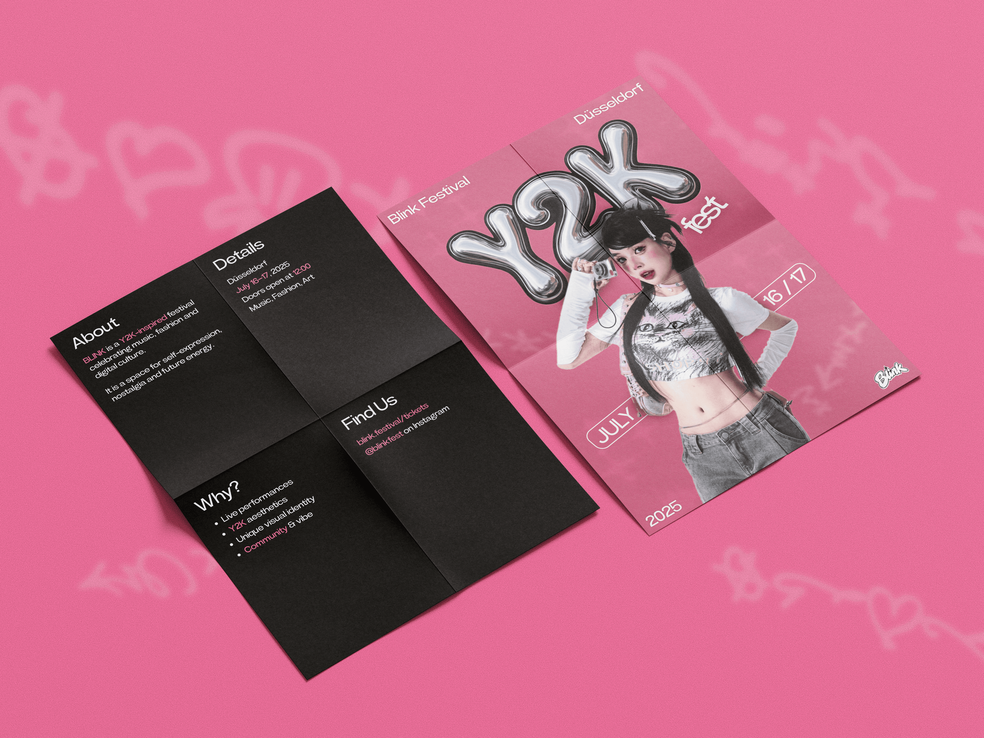
Flyer — a folded, information-dense format (About, Details, Why, Find Us) that had to carry the same energy in a much smaller, text-heavier layout.
Ticket — barcode, gate, date, and city information integrated without breaking the visual language.

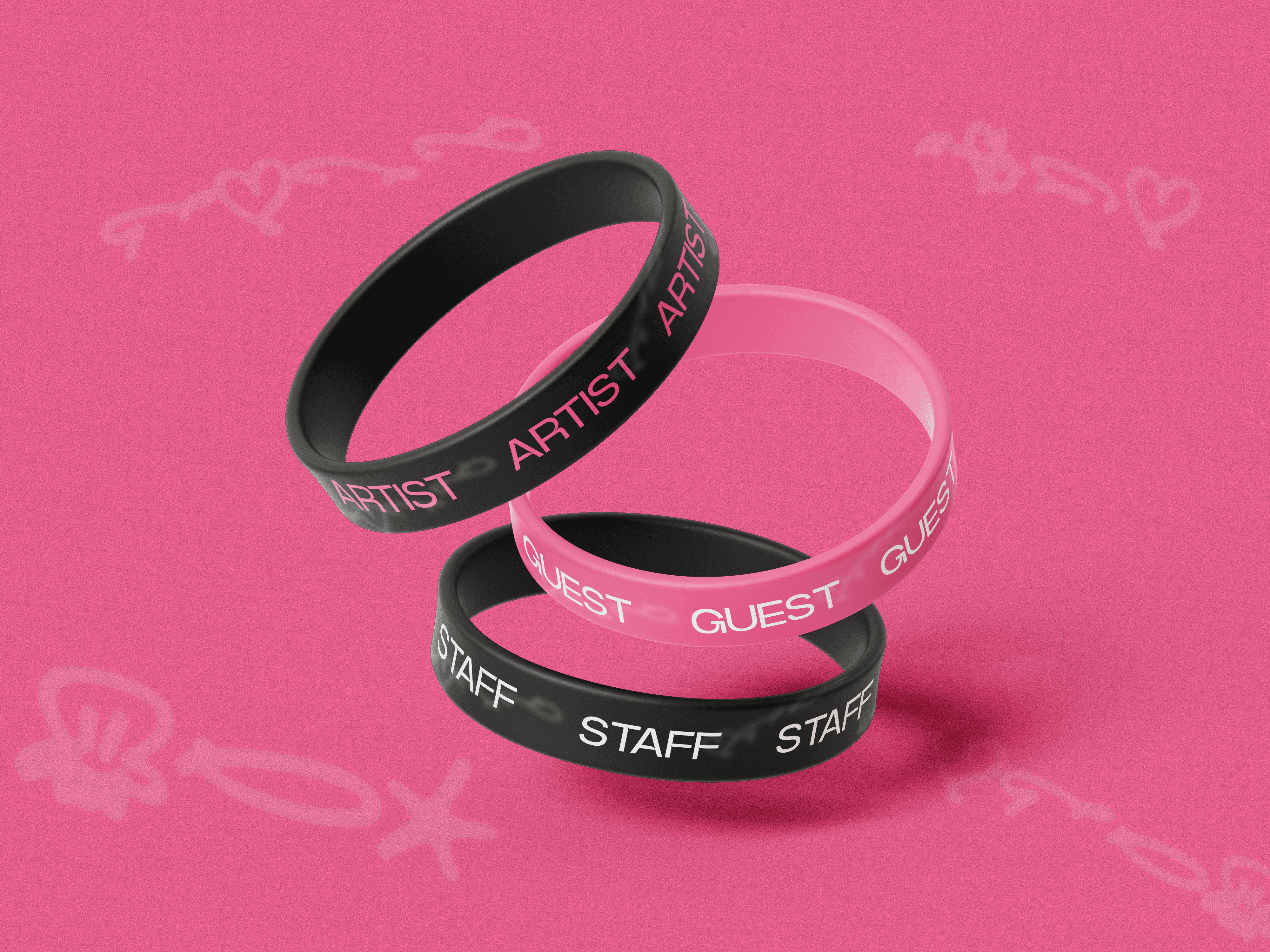
Wristbands — Artist / Guest / Staff variants, color-coded (pink and black) for at-a-glance role recognition, a small but real functional design problem.
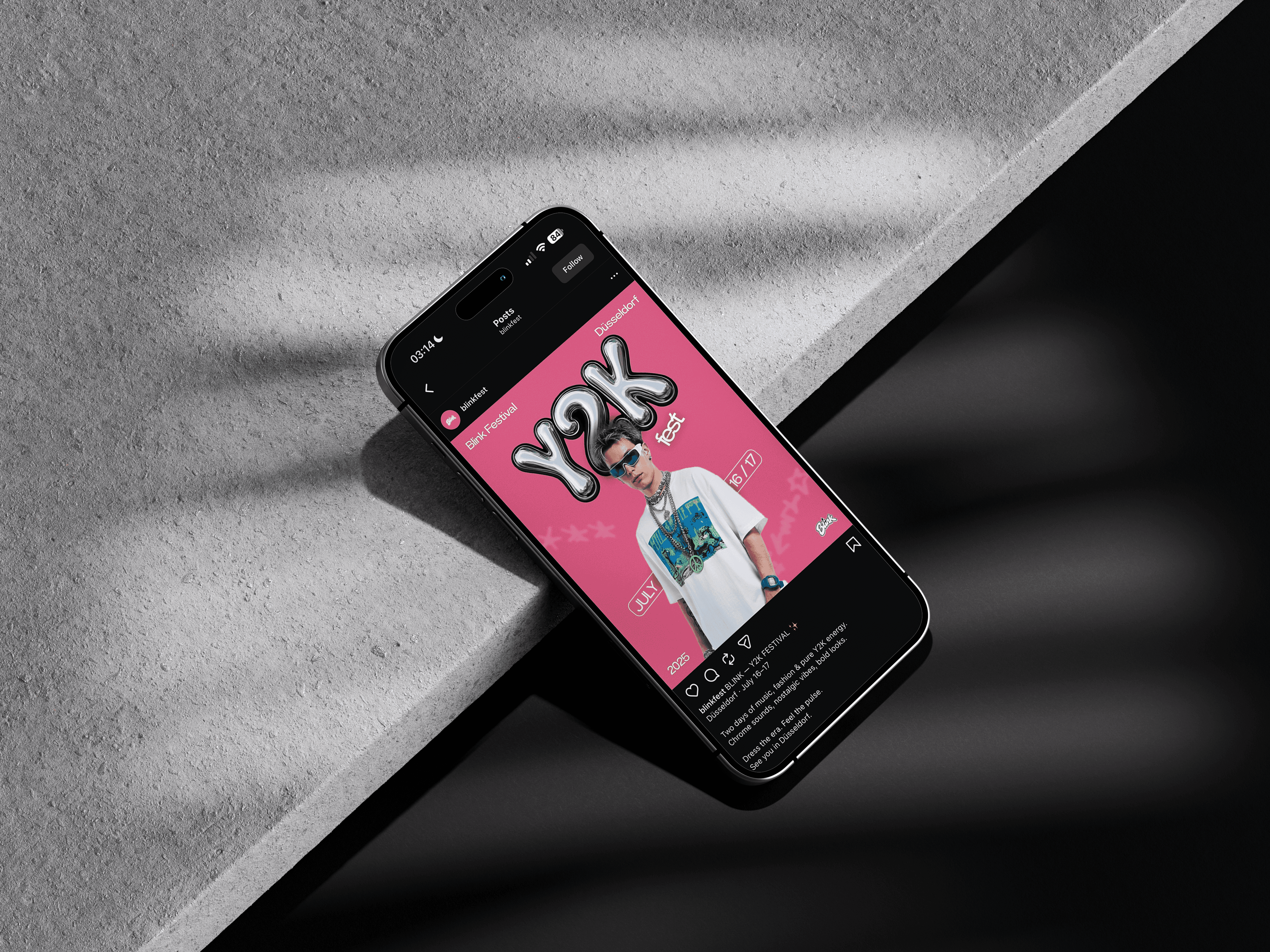
Social media — the same key visual reformatted for Instagram's vertical, dark-UI context, holding up next to real app chrome.
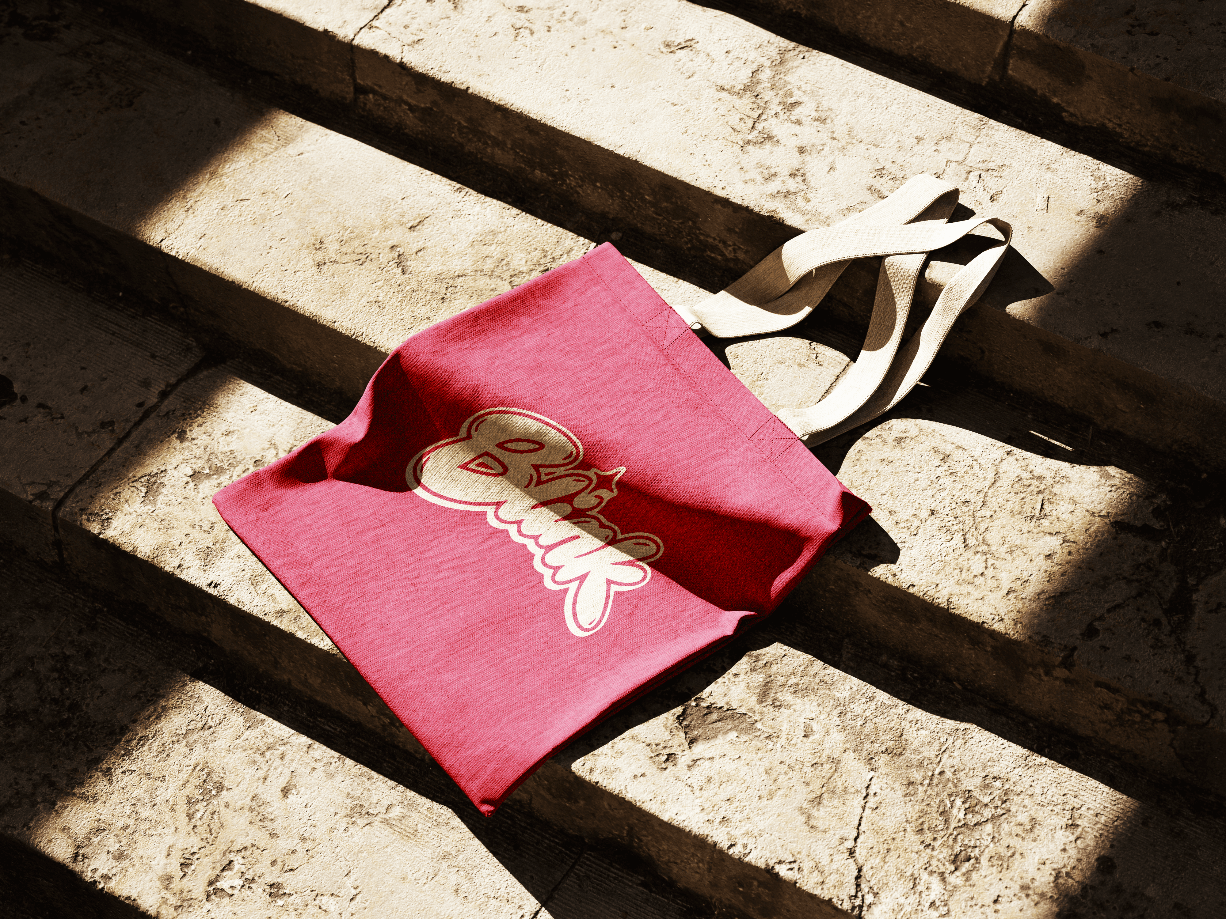
Merchandise — tote bag with a simplified, single-color logo lockup for screen printing, testing the brand at its most reduced.
Banner — large-format outdoor application, stress-testing contrast and type scale at distance.

Two model "faces" for BLINK (one feminine, one masculine styling) were used across posters and social content to keep the campaign feeling like it belongs to a real, diverse festival crowd rather than a single stock image.
Reflection
The main lesson from this project: a strong aesthetic reference (Y2K) isn't a system on its own. It becomes one only once you've made explicit typography and color decisions that hold up under different constraints. Power Grotesk as a counterweight to the chrome lettering was the single decision that did the most work; without it, this would read as a mood board, not a brand.
If I extended this project further, I'd push the motion/animated identity (a glowing chrome logo animation is an obvious next step for a festival brand this digital-native) and stress-test the system on a merch category beyond apparel, like signage or wayfinding, where the black/pink/white palette would have to do more structural work.
BLINK Festival is an academic project developed for a Communication Design course at HSRW and is not a real event.