Overview
1. Research and Concept
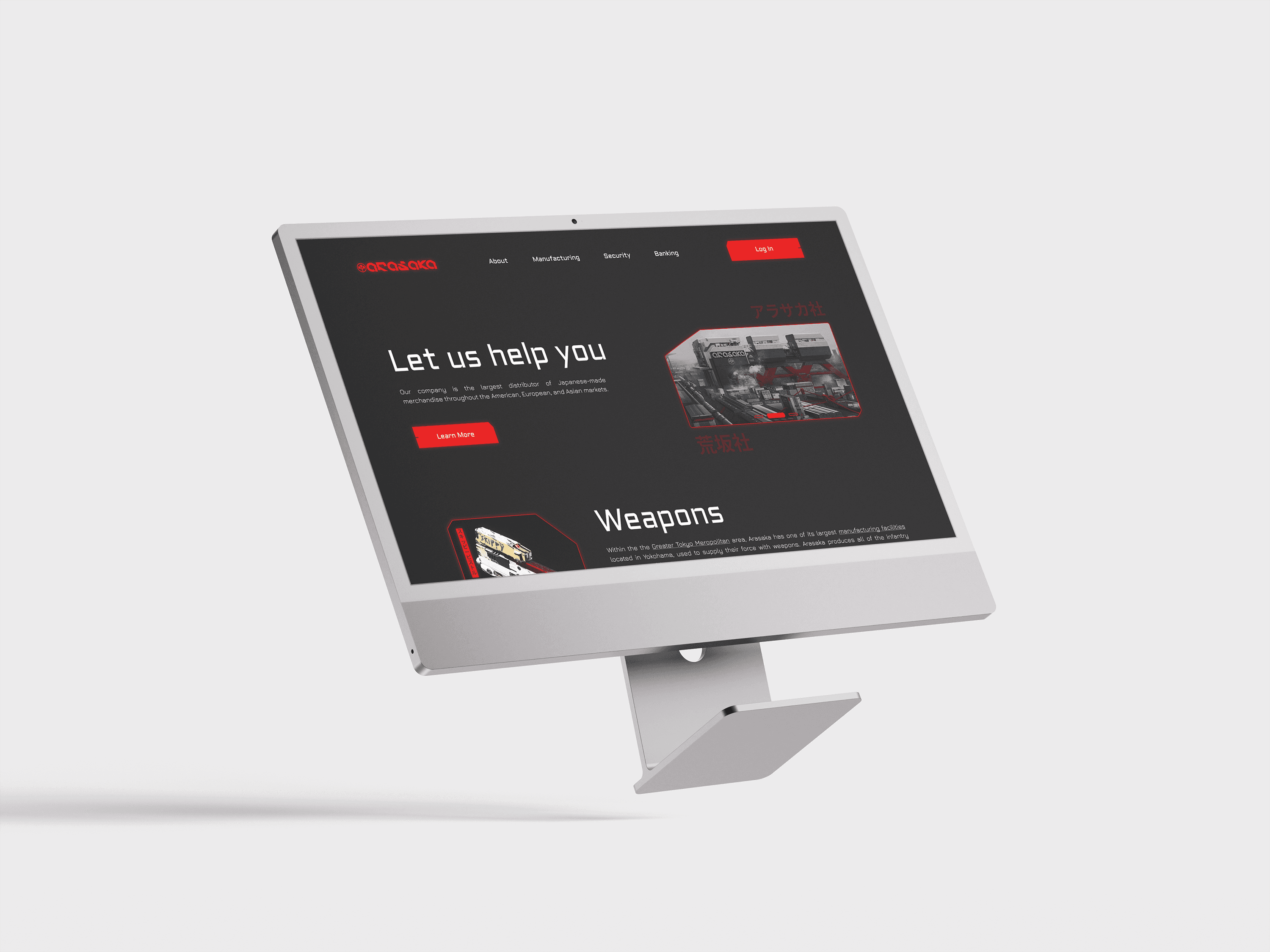
Before starting the design process, I needed to understand the visual style of the Cyberpunk 2077 universe and the identity of Arasaka as a corporation. This included:
Analyzing official content (game, artwork, comics).
Defining key elements of Arasaka’s brand identity: black, red, and white color scheme, futuristic typography, neon accents, and Japanese aesthetics.
Studying in-game UI and interfaces to maintain authenticity.
2. Wireframing
At this stage, I developed the site structure:
A homepage featuring the corporation’s overview.
Sections for manufacturing, security, and banking services.
Product cards for cyberware, weapons, and security services.
CTA buttons and interactive user engagement elements.
3. Design and Styling
The main design choices included:
Color palette: a dark background with red and white accents.
Typography: futuristic monospaced or tech-styled fonts.
Graphics: cyberpunk-inspired visuals, glitch effects, neon lights, holographic elements.
Animations: smooth transitions, blinking effects, and digital noise.
4. Interactive Elements Development
Buttons with glowing effects.
A slider for ordering services.
Hover effects on product cards.
5. Final Development and Testing
Optimizing the site for different devices.
Ensuring responsive design and a smooth user experience.
Final UI/UX refinements.
This process ensures that the website fits seamlessly into the Cyberpunk universe and remains recognizable to Arasaka fans.


